兼容Qt4/Qt5版本Qml控件ComboBox

组合框是一个组合按钮和弹出列表。它提供了一种向用户显示选项列表的方法,这种方法占用最小的屏幕空间。

ComboBox 备注
导入方法 文件导入
兼容性 QtQuick 1.x
QtQuick 2.x
继承 Item

属性

描述

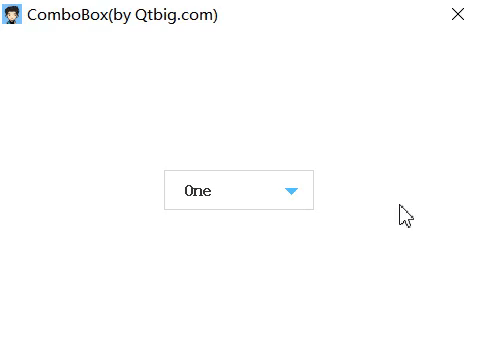
  组合框是一个组合按钮和弹出列表。它提供了一种向用户显示选项列表的方法,这种方法占用最小的屏幕空间。数据模型通常是一个javascript数组、C++端的List类型、未来还会提供对ListModel或整数的数据模型支持。

1
2
3
ComboBox {
model: ["One", "Two", "Three", "Four", "Five"]
}

示例

ComboBox

属性文档

关于更新

  • 文章首发于微信公众号你才小学生
  • 后续更新于Qtbig哥(qtbig.com)

源码

1
2
3
4
5
6
7
8
9
10
11
12
13
14
15
16
17
18
19
20
21
22
23
24
25
26
27
28
29
30
31
32
33
34
35
36
37
38
39
40
41
42
43
44
45
46
47
48
49
50
51
52
53
54
55
56
57
58
59
60
61
62
63
64
65
66
67
68
69
70
71
72
73
74
75
76
77
78
79
80
81
82
83
84
85
86
87
88
89
90
91
92
93
94
95
96
97
98
99
100
101
102
103
104
105
106
107
108
109
110
111
112
113
114
115
116
117
118
119
120
121
122
123
124
125
126
127
128
129
130
131
132
133
134
135
136
137
138
139
140
141
142
143
144
145
146
147
148
149
150
151
152
153
154
155
156
157
158
159
160
161
162
163
164
165
166
167
168
169
170
171
172
173
174
175
176
177
178
179
180
181
182
183
184
185
186
187
188
189
190
191
192
193
194
195
196
197
198
199
200
201
202
/**********************************************************
Author: Qtbig哥
WeChat Official Accounts Platform: nicaixiaoxuesheng (文章首发)
Website: qtbig.com(后续更新)
Email: 2088201923@qq.com
QQ交流群: 732271126
LISCENSE: MIT
**********************************************************/
import QtQuick 2.0

Item {
id: root

/// 此属性拥有组合框中当前项的索引。默认值为-1,当count为0时-1,其他情况为0或其他。
property alias currentIndex: _listView.currentIndex

/**
* @brief: 此属性拥有组合框中当前项的文本。
* @note: read-only
*/
property string currentText: _listView.currentText

/// 此属性为组合框提供数据模型。
property alias model: _listView.model

/// 此属性可以判断组合框是否被按下。按钮可以通过触摸或按键事件按下。
property alias pressed: mouseArea.pressed

/// 此属性可以判断组合框是否处于展开状态。
property bool down: false;

/**
* @brief: 组合框中项数。
* @note: read-only
*/
property alias count: _listView.count

/**
* @brief 该属性为组合框代理项。
* @note: 自定义delegate需要手动设置down属性与currentIndex属性以隐藏下拉列表和设置下拉列表当前项。
*/
property Component delegate: _private.defaultDelegate

/// 用于设置指示器,标识组合框是否处于展开状态。常用的设置为三角形指示器。
property Component indicator: _private.defaultIndicator

/// 用于设置组合框的可视项。
property Component contentItem: _private.defaultContentItem

/// 用于设置组合框的可视项的背景。
property Component background: _private.defaultBackground

/// 用于设置下拉框的背景项,设置其宽高可以限制下拉框的大小。默认展示下拉框的三个项目。
property Component popup: _private.defaultPopup

width: contentItemId.item.width
height: contentItemId.item.height

/// background
Loader {
id: backgroundId
sourceComponent: background
}

/// contentItem
Item {
width: contentItemId.item.width
height: contentItemId.item.height

Loader {
id: contentItemId
sourceComponent: contentItem
}

MouseArea {
id: mouseArea
anchors.fill: parent
onReleased: root.down = !root.down
}
}

/// indicator
Loader {
id: indicatorId
sourceComponent: indicator
}

/// popup
/// 下拉列表ListView
Loader {
id: popupId
y: contentItemId.item.height
visible: root.down
clip: true
sourceComponent: popup

ListView {
id: _listView
property string currentText: ""
width: popupId.item.width
height: popupId.item.height
clip: true
delegate: root.delegate
onCurrentIndexChanged: currentText = model[currentIndex]
}
}

/* Private */
QtObject {
id: _private
property Component defaultDelegate: Rectangle {
width: 150; height: 40

Text {
anchors.verticalCenter: parent.verticalCenter
anchors.left: parent.left
anchors.leftMargin: 20
/* 鼠标进入会显示对应高亮文字。 */
color: delegateMouseArea.isEnter ? "#4cbeff" : "black"
text: modelData
font.bold: true
font.pixelSize: 17
}

Rectangle {
id: line
anchors.horizontalCenter: parent.horizontalCenter
anchors.bottom: parent.bottom
width: parent.width*0.8
height: 1
color: "#e6e8ea"
/* 最后一个项不隐藏分隔线。 */
visible: index !== root.count - 1
}

MouseArea {
id: delegateMouseArea
property bool isEnter: false
anchors.fill: parent
hoverEnabled: true /* 开启鼠标实时捕抓。 */
onEntered: isEnter = true
onExited: isEnter = false
onClicked: {
/* 当选项被选中后需要用户设置down的状态为false,以让下拉列表收起来。 */
/* 还需设置currentIndex的值,以至于可以刷新contentItem的文字显示。 */
root.down = false
root.currentIndex = index
}
}
}

property Component defaultIndicator: Item {
width: root.width; height: root.height

/* 三角形指示器 */
Item {
anchors.verticalCenter: parent.verticalCenter
anchors.verticalCenterOffset: 2
anchors.right: parent.right
anchors.rightMargin: 15
clip: true
width: 2*height; height: 7

Rectangle {
anchors.horizontalCenter: parent.horizontalCenter
anchors.verticalCenter: parent.verticalCenter
anchors.verticalCenterOffset: -parent.height/2
width: Math.sqrt(parent.width*parent.width*2)/2; height: width
color: root.down ? "white" : "#4cbeff"
rotation: 45
}
}
}

property Component defaultContentItem: Rectangle {
width: 150; height: 40
color: root.down ? "#4cbeff" : "white"
border.width: root.down ? 0 : 1
border.color: "#d5d5d5"

/* 显示当前下拉列表选中的内容 */
Text {
anchors.verticalCenter: parent.verticalCenter
anchors.left: parent.left
anchors.leftMargin: 20
color: root.down ? "white" : "#333333"
text: root.currentText
font.bold: true
font.pixelSize: 17
}
}

property Component defaultBackground: Item { }

/* 设置popup可以设置下拉框的高度和宽度 */
property Component defaultPopup: Rectangle {
width: root.width; height: root.height * 3
color: "#00000000"
border.color: "#d5d5d5"
}
}
}