使用Qml的Button控件修改而成。
源码
Button源码
1
2
3
4
5
6
7
8
9
10
11
12
13
14
15
16
17
18
19
20
21
22
23
24
25
26
27
28
29
30
31
32
33
34
35
import QtQuick 2.0
import QtQuick.Controls 2.0
import QtGraphicalEffects 1.0
Button {
id: root
property color backgroundDefaultColor: "#4E5BF2"
property color backgroundPressedColor: Qt.darker(backgroundDefaultColor, 1.2)
property color contentItemTextColor: "white"
text: "Button"
contentItem: Text {
text: root.text
color: root.contentItemTextColor
font.pixelSize: 15
font.family: "Arial"
font.weight: Font.Thin
horizontalAlignment: Text.AlignHCenter
verticalAlignment: Text.AlignVCenter
elide: Text.ElideRight
}
background: Rectangle {
implicitWidth: 83
implicitHeight: 37
color: root.down ? root.backgroundPressedColor : root.backgroundDefaultColor
radius: 3
layer.enabled: true
layer.effect: DropShadow {
transparentBorder: true
color: root.down ? root.backgroundPressedColor : root.backgroundDefaultColor
samples: 20
}
}
}按钮组样式源码
1
2
3
4
5
6
7
8
9
10
11
12
13
14
15
16
17
18
19
20
21
22
23
24
25
26
27
28
29
30
31
32
33
34
35
36
37
38
39
40
41
42
43
44
45
46
47
48
49
50
51
52
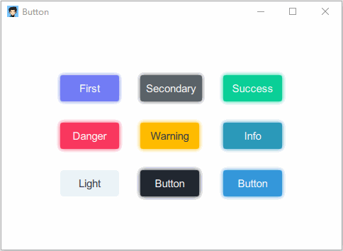
53GridLayout {
anchors.centerIn: parent
rows: 3
columns: 3
rowSpacing: 30
columnSpacing: 30
Button {
text: "First"
backgroundDefaultColor: "#727CF5"
}
Button {
text: "Secondary"
backgroundDefaultColor: "#5A6268"
}
Button {
text: "Success"
backgroundDefaultColor: "#0ACF97"
}
Button {
text: "Danger"
backgroundDefaultColor: "#F9375E"
}
Button {
text: "Warning"
contentItemTextColor: "#313A46"
backgroundDefaultColor: "#FFBC00"
}
Button {
text: "Info"
backgroundDefaultColor: "#2B99B9"
}
Button {
text: "Light"
contentItemTextColor: "#313A46"
backgroundDefaultColor: "#EEF2F7"
}
Button {
backgroundDefaultColor: "#212730"
backgroundPressedColor: "#313A46"
}
Button {
backgroundDefaultColor: "#3498DB"
}
}